

Do you ever wonder why you’re drawn to certain colors – for your cars, your home, your office or even the clothing you wear?
It may not be something you’ve given tremendous thought, but colors are not only influenced by fashion trends, but by our emotions, lifestyles, societal influences, the environment…and even our diets!
I spoke with Dee Schlotter, the color expert for PPG Paints (http://www.ppgpaints.com), whose profession is devoted to the science and the psychology of color. She uses her expertise to select hues that appeal to consumers and notes trends so PPG can service a variety of industries (including: automotive, planes, home and office interiors and electronic devices).
Part of Schlotter’s job is to keep up with the colors people are selecting, to know what color a certain type of room should be (i.e. to keep people energized or calm, to help them feel organized) and have an eye on trends and societal influences that are impacting choices. It was quite a revelation speaking with her and discovering there is extensive psychological and societal research behind each color.
SHW: You’ve said that color often corresponds to mood. What common colors do people choose that reflect their emotions?
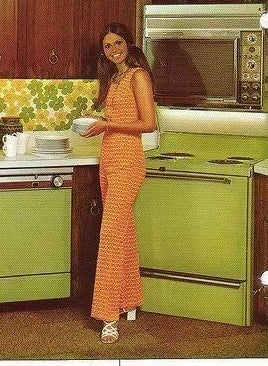
DS: Color preference is subjective, but not random. The shades that come out today have involved a lot of study. We often say that ‘we influence trends as much as trends influence us.’ There are societal, geographic, demographic and lifestyle influences behind color. For instance, there is an avocado color that pertained to a certain generation (Boomers). How we connect to colors have to do with our memories and where we came from.
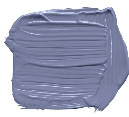
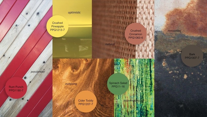
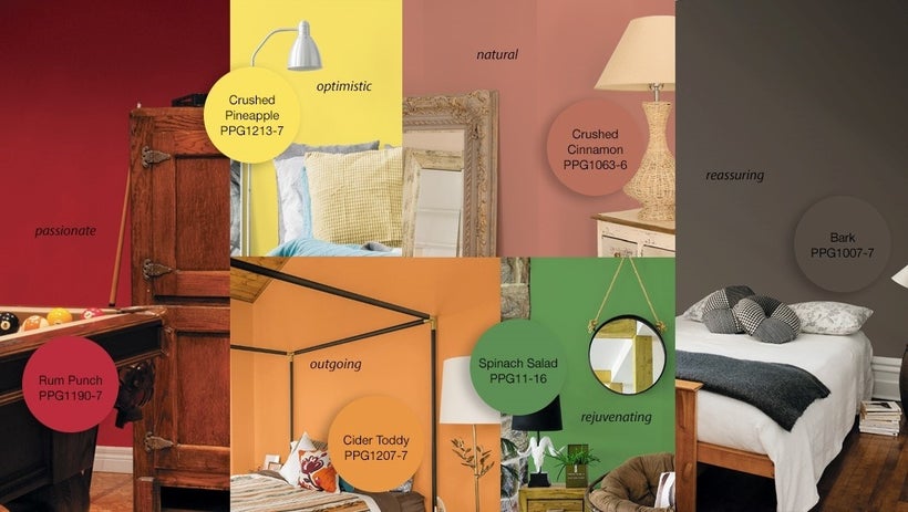
Very often, colors come from nature and the things that go back to our earliest memories help us connect and feel nostalgic..and good! As far as what’s trending right now, our color of the year (2017) was Violet Verbena. We found that purples are only selected 1 percent of the time, so we tried to make the best version of this purple. Violet Verbena was meant to represent a blended society. The male-female boundaries are blurred, age is blurred and it’s really a color that anyone might choose.
As a paint color, it actually went from being an insignificant one on our display to being our best. At http://www.ppgvoiceofcolor.com, we dive a little deeper into the significance of color. One thing we’ve highlighted is how geography impacts it too. For instance, take the color yellow. Yellow can reflect optimism and hope in the U.S., but in Egypt it is for mourning. In Japan, it signifies courage and in India it’s a top color for merchandising.
SHW: What’s the most popular color for cars today?
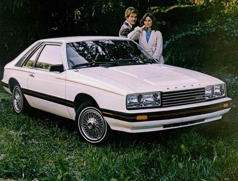
DS: Right now it is white. This actually shifted from silver. Also, the white of today is a lot different than it was 10, 20, 30 years ago.

DS: Whites and light grays and very neutral colors convey silence and space. They create few distractions. We saw three years ago that there was a lot of white in hotels and it’s because there’s so much chatter in our lives and white takes away from the distractions. People feel there is a cleansing nature to it. So this character you refer to probably feels less overwhelmed by all the noise when she walks into her ‘shades of vanilla’ home. It’s probably a relief to her that it’s clean and uncluttered.
SHW: My sons want to turn one of our basement rooms into a “man cave” and have asked about painting the walls red. I was wondering about this color for four rambunctious boys (ages 8-14).
DS: Be prepared for them to have lots of energy and an increase in appetite…4 sons means you will definitely see a frequency in snacking if they’ve been hanging out in a red room!
SHW: Oh no! We don’t need that. Red increases appetite?
DS: Yes, very much so and it’s a reminder of certain foods. Even meat has some red and of course, certain fruits and vegetables. Blues actually decrease appetites. So when you walk into a popular restaurant, you seldom see blue and you do see reds and oranges and yellow – like with McDonald’s.
SHW: Besides the sadness that can be attached to hospitals in general, when we walk into those buildings, the walls and the floors and everything seems so drab and colorless.
DS: It’s a bad design, but it is changing now because the Boomers are moving into that area and they may need assisted living. We actually just did a presentation that reflects a complete shift for hospitals and places for elder care. You will see the boomers having an impact like they did with all parts of their lives. That will be reflected in a lot more colors taken from nature and gardening.There’s going to be that wow factor soon simply from changing the color of the paint on the walls.
SHW: How does clothing fashion impact the colors you choose for new paints?
DS: We look at runway fashion very seriously because it starts on the runway and then it’s a little under 15 months until it gets to home decor. We see that the colors people wear reflect their personalities and then they like to have those colors surrounding them in their home.
SHW: I noticed that varying shades of pink are in style for the spring. I actually wondered how the Women’s March in January may or may not have impacted that.
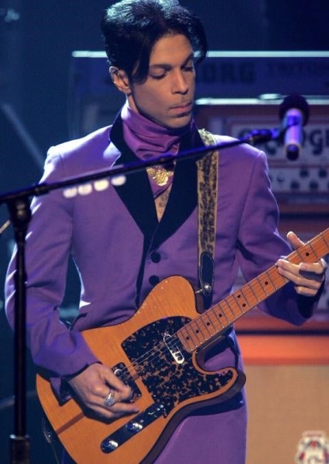
DS: Yes, colors from society are on our minds. Greens from people’s smoothies when there is a focus on health – even that comes out in fashion and home decor. Light pink, like you mentioned, is a compassionate color. We saw that color after 9/11 and we’re seeing it now. We picked Violet Verbena and sadly, Prince died a couple of months later and we noticed people gravitating towards different shades of purple…People think they’re not affected by the colors they see when it’s on the news and in the media, but it can be subconscious. Seeing the televised Prince tributes…the news about Prince featuring video or a photo left purple fresh in people’s minds.
To connect with Dee Schlotter and get some insight on the hues best suited for you, go to www.ppgvoiceofcolor.com.
